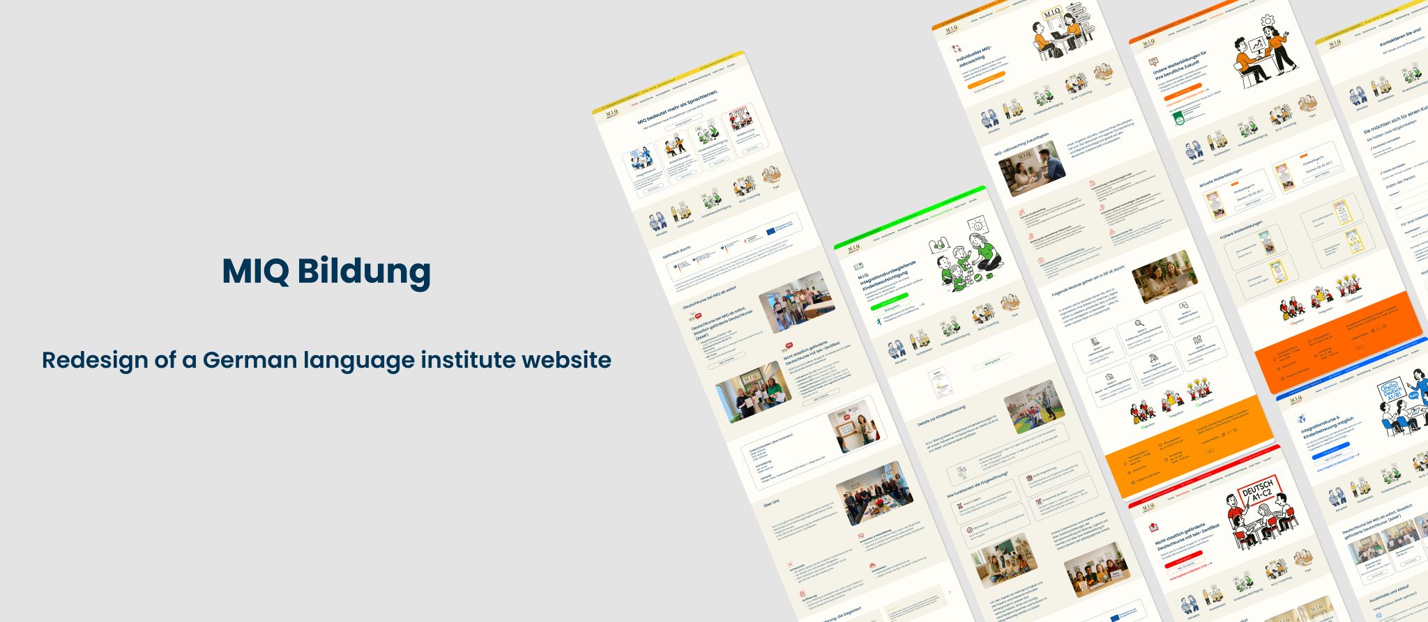
A German language school website redesigned for people who are still learning German.
MIQ Bildung helps migrants in Berlin learn German and access job opportunities. However, the original website, built in 2012, was difficult to navigate, hard to read on mobile devices, and overwhelming for users still learning the language.
The redesign focused on creating a simpler, clearer, and more welcoming experience.
Weak visual hierarchy burying key information like schedules and registration
For a school whose mission is to make integration easier, the website was making the first step harder.
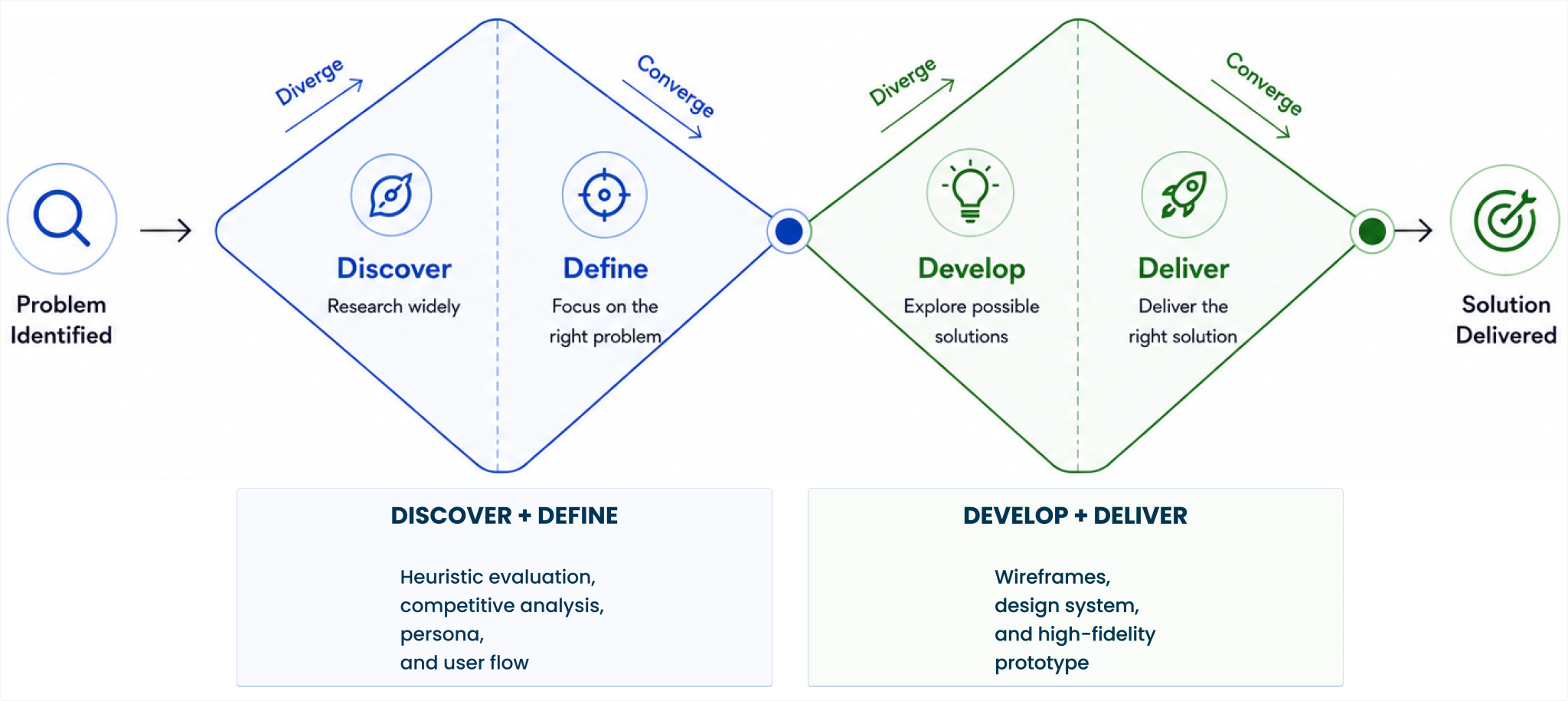
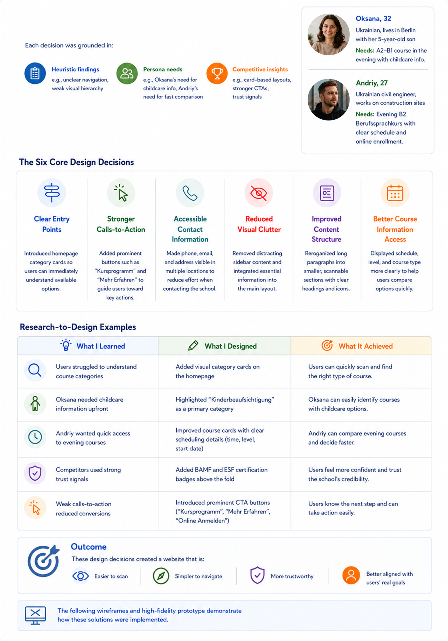
The Process
I followed the Double Diamond framework — moving from understanding the problem to delivering a focused, user-centered redesign.
Discover
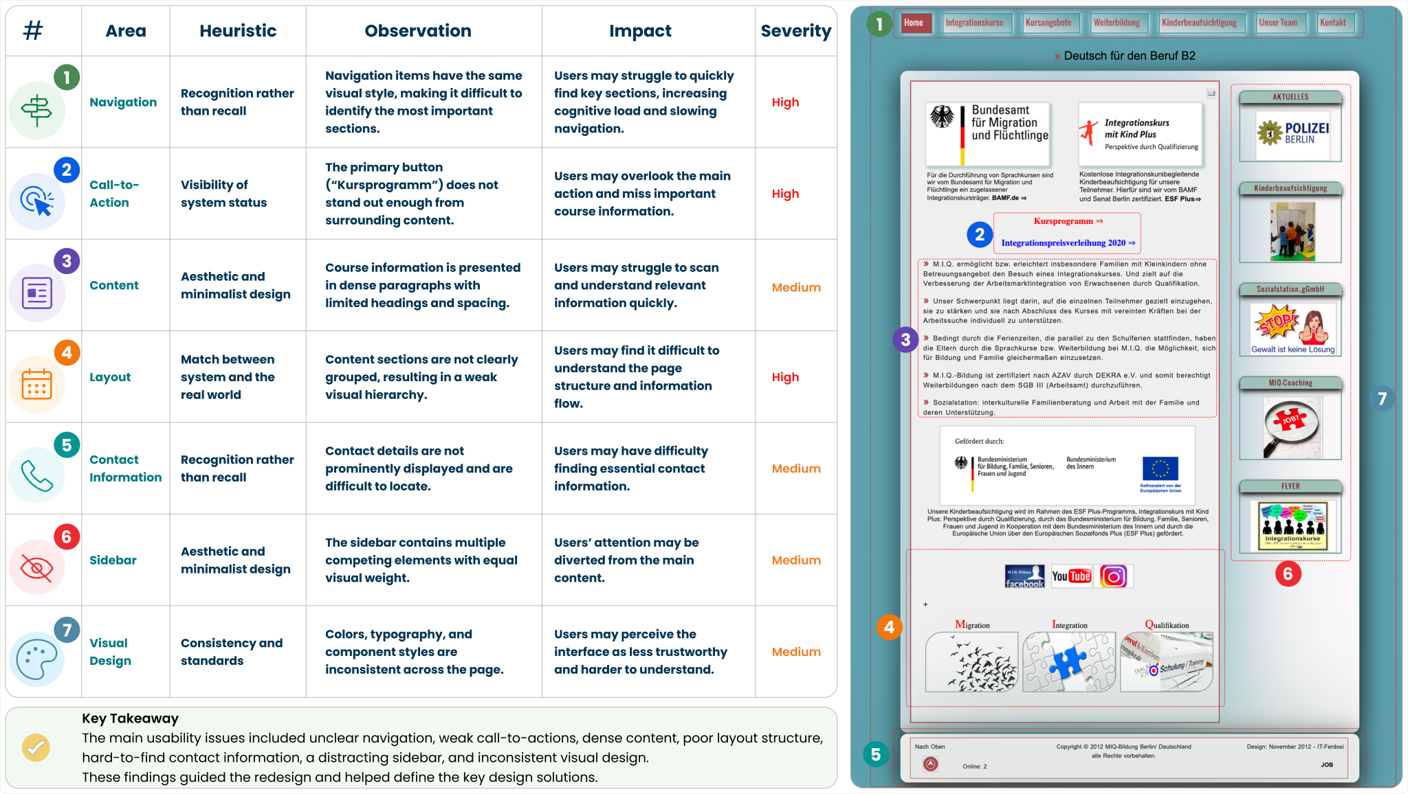
Heuristic Evaluation:
I evaluated the existing MIQ website using Nielsen Norman Group’s 10 Usability Heuristics, a widely recognized framework for identifying and prioritizing usability issues. I reviewed 6 key pages to uncover recurring patterns and areas for improvement.
Why focus on the homepage?
The same issues—such as text-heavy content, weak visual hierarchy, and unclear navigation—appeared across multiple pages. To avoid repetition, I used the homepage as a representative example because it serves as the main entry point and creates the first impression for new users.
Severity Scale
Each issue was prioritized based on its impact on users’ ability to complete key tasks.
🔴 High — Blocks critical actions such as finding courses or registering.
🟡 Medium — Creates confusion or friction but does not prevent task completion.
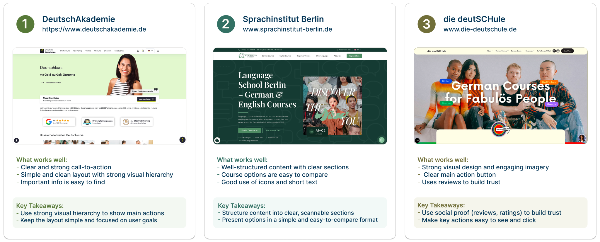
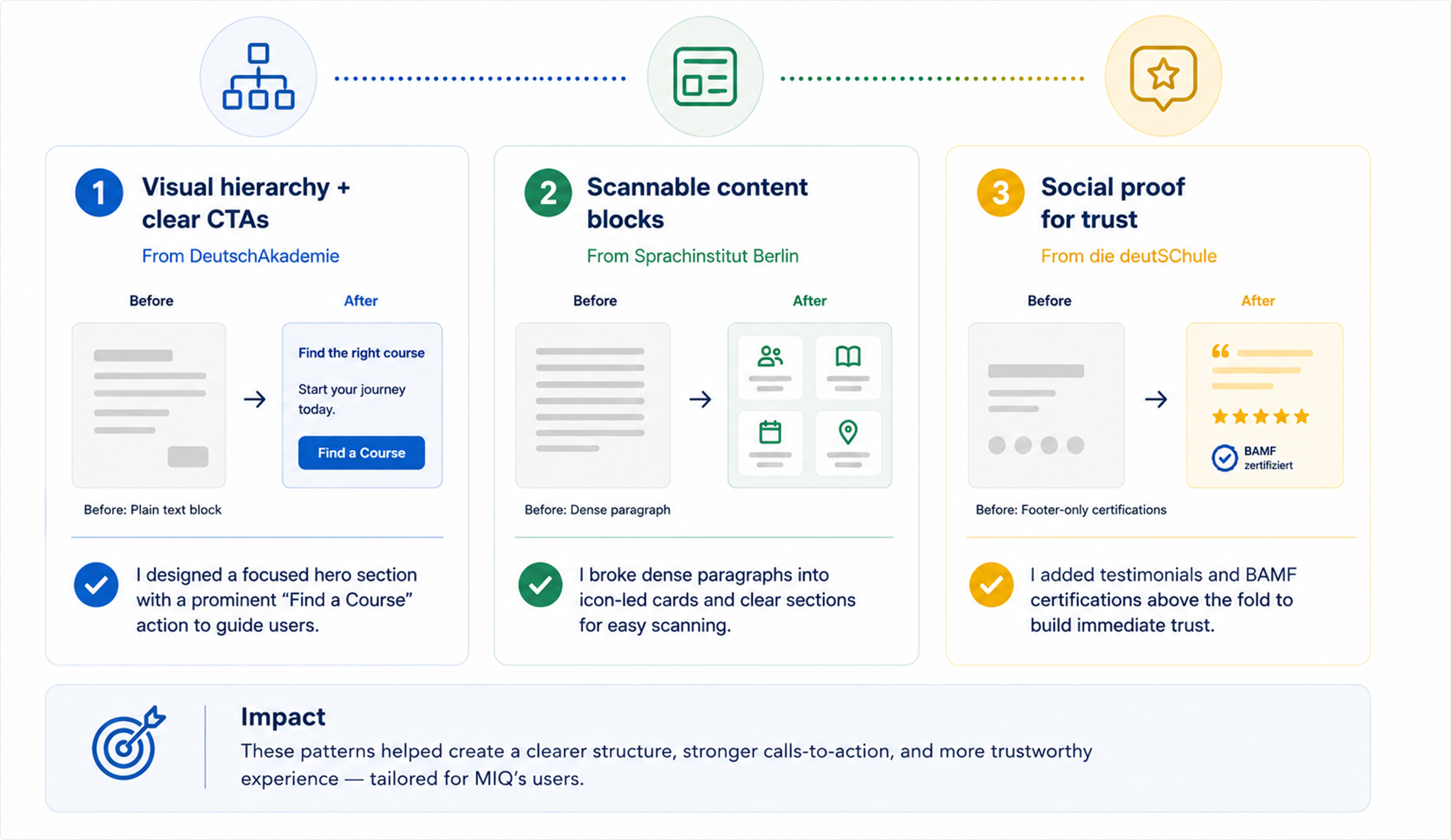
Competitive Analysis
To understand how leading language schools solve similar usability challenges, I analyzed 3 competitors — DeutschAkademie, Sprachinstitut Berlin, and die deutSCHule — each representing a different approach to course discovery and visual design.
I focused on 3 areas most relevant to MIQ’s users: navigation clarity, content structure, and how users are guided to key actions.
What I Took to MIQ
Three patterns from competitor research that directly addressed the main usability issues in the heuristic evaluation — unclear navigation, hard-to-read content, and low visibility of key actions.
Define
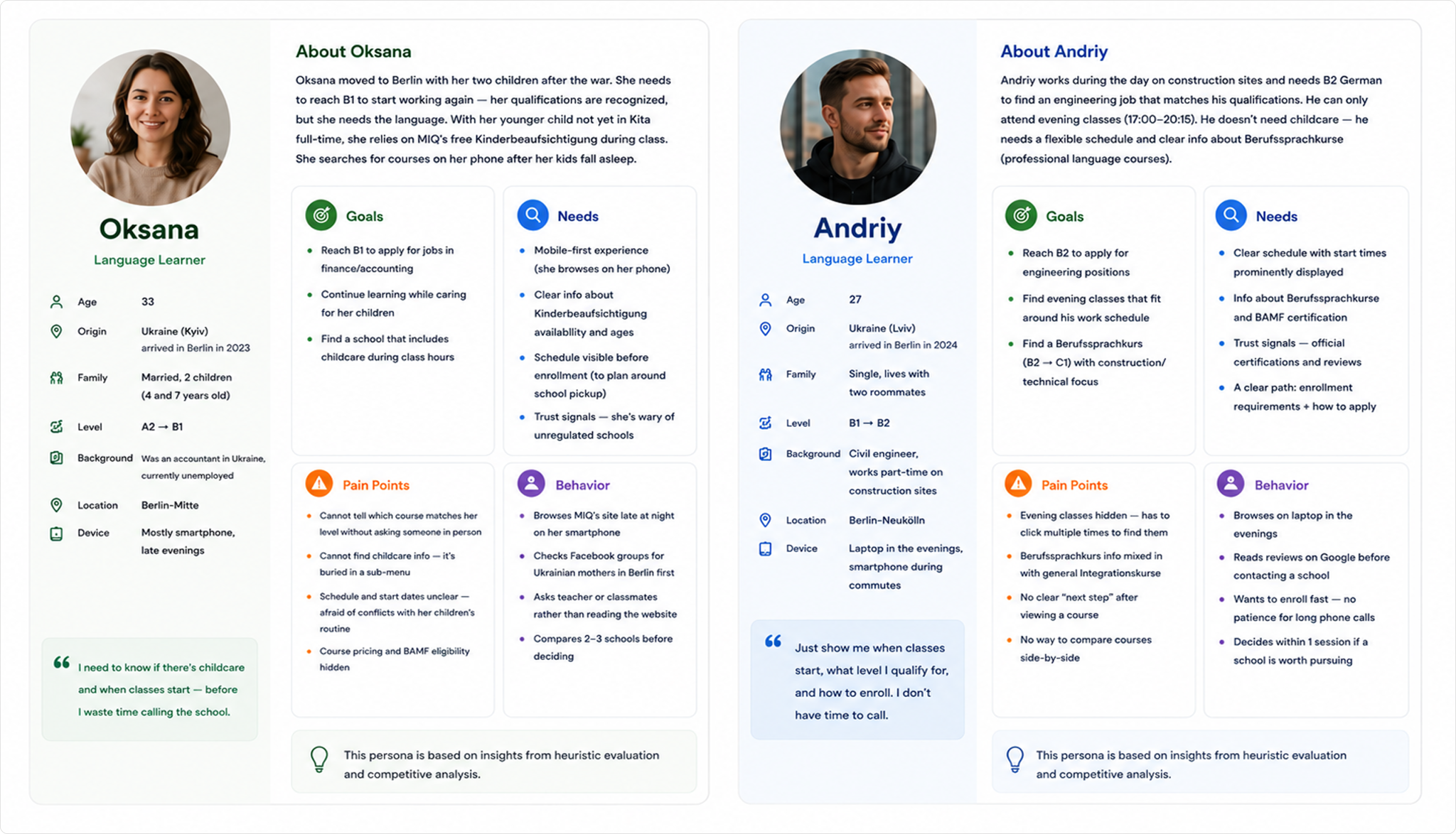
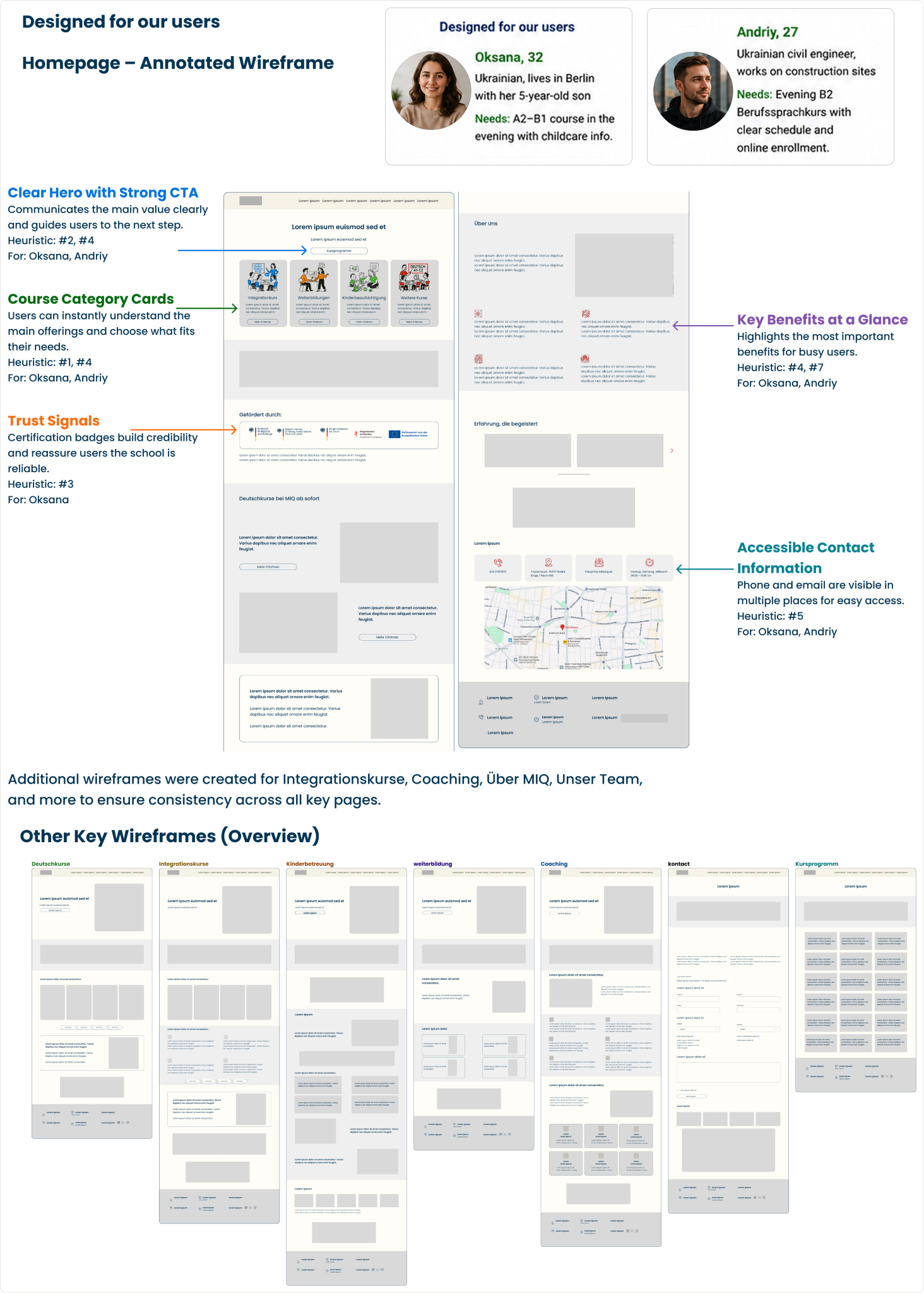
MIQ User Personas
MIQ serves a diverse audience. Based on my time studying there as a former student — where most of my classmates were Ukrainian, and many were young mothers — I built two personas representing the most common user types.
These personas are synthesized from three sources: my observation as a former MIQ student, heuristic findings from auditing the existing website, and competitive patterns from leading language schools.
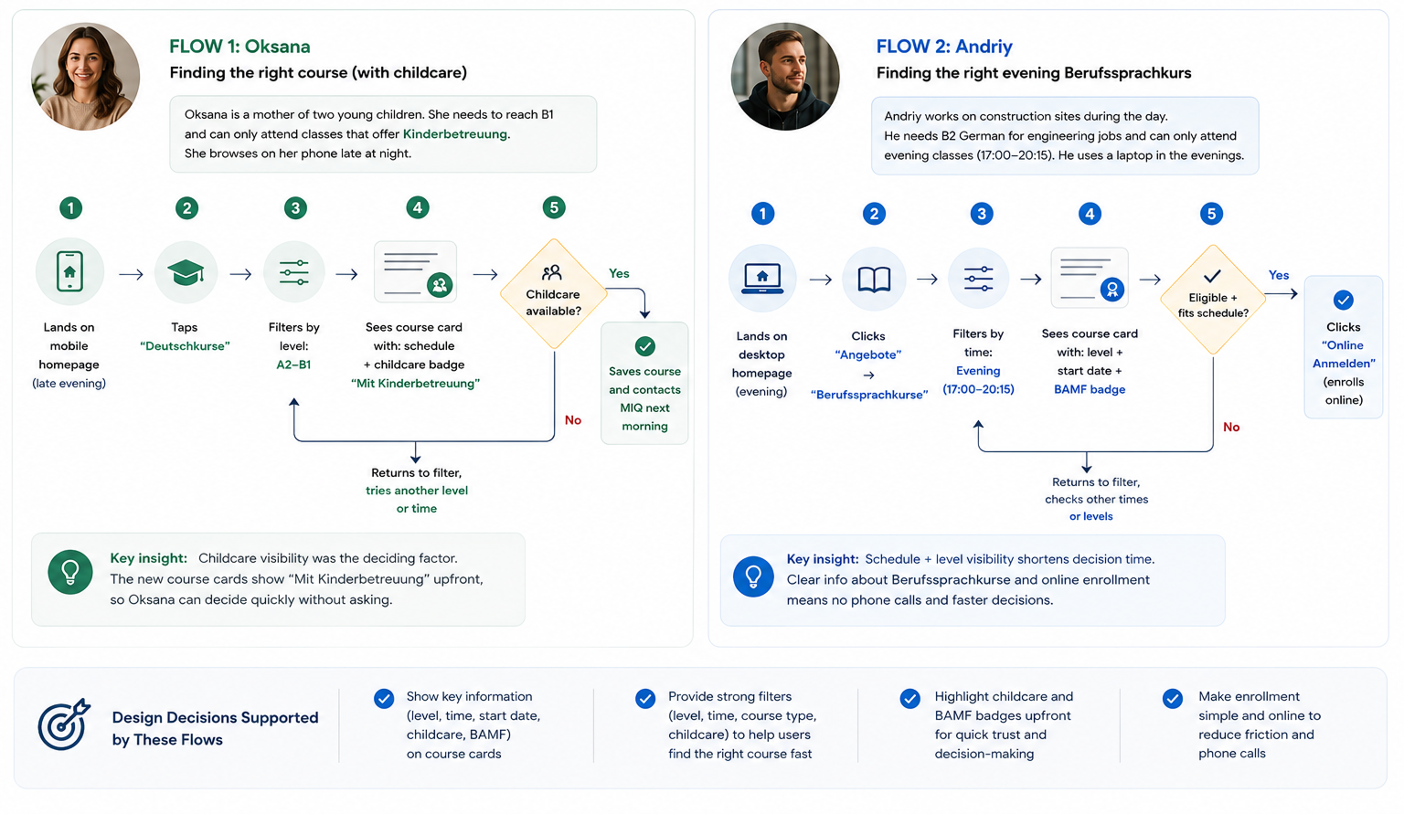
User Flow
How users find a course and contact MIQ
I mapped two flows based on the two personas — because each scenario has different needs and entry points.
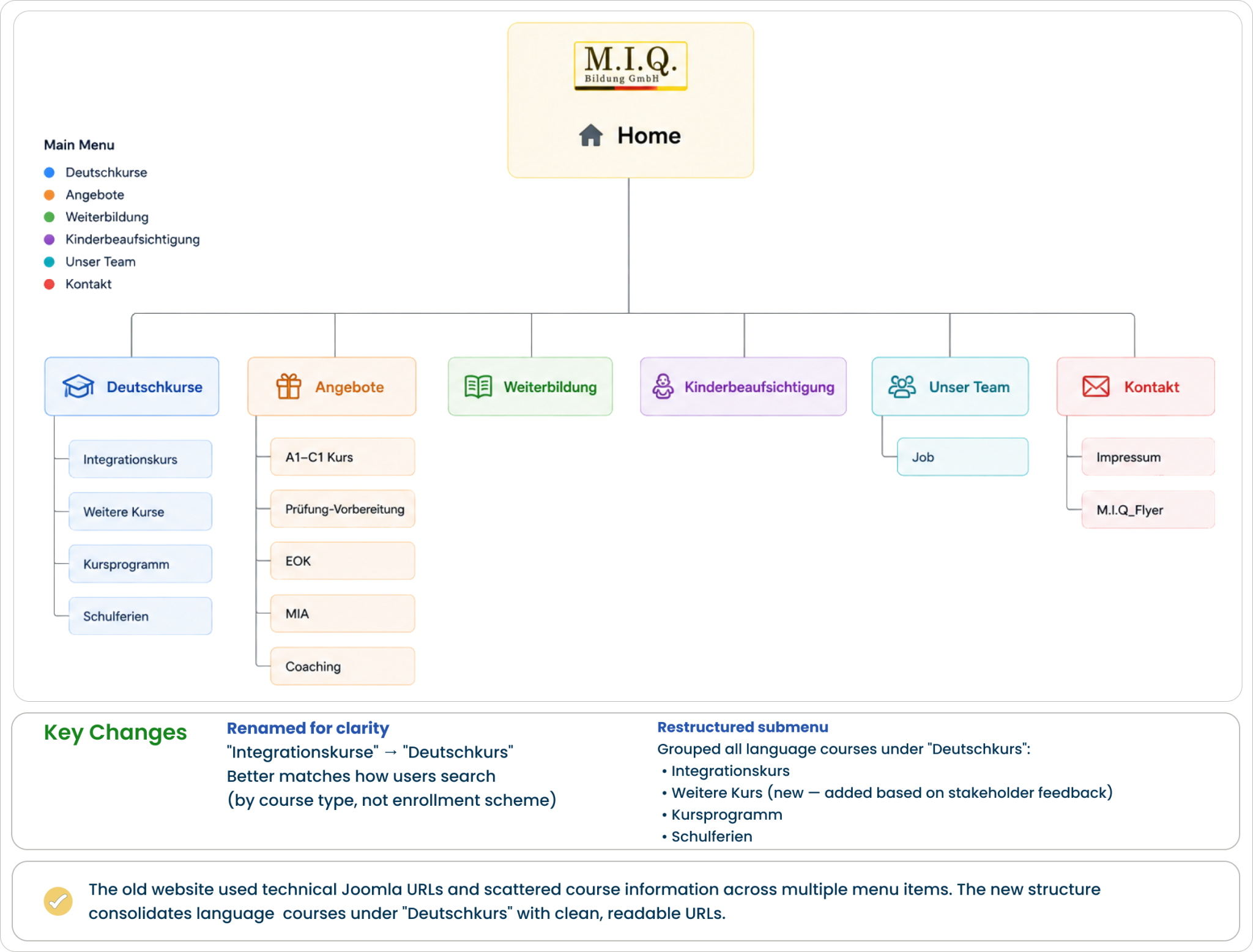
Sitemap
The website’s information architecture was reorganized to create a simpler, clearer, and more user-friendly navigation structure.
The diagram below compares the original sitemap with the redesigned version and highlights the key structural improvements.
Develop (Design)
Design Approach
The redesign translated research insights into six core design decisions that directly addressed the most critical usability issues identified during the heuristic evaluation.
Mid-Fidelity Wireframes
These mid-fidelity wireframes highlight the key pages of the redesigned website. They were used to define layout structure, content hierarchy, and user flow before moving to high-fidelity designs.
Deliver
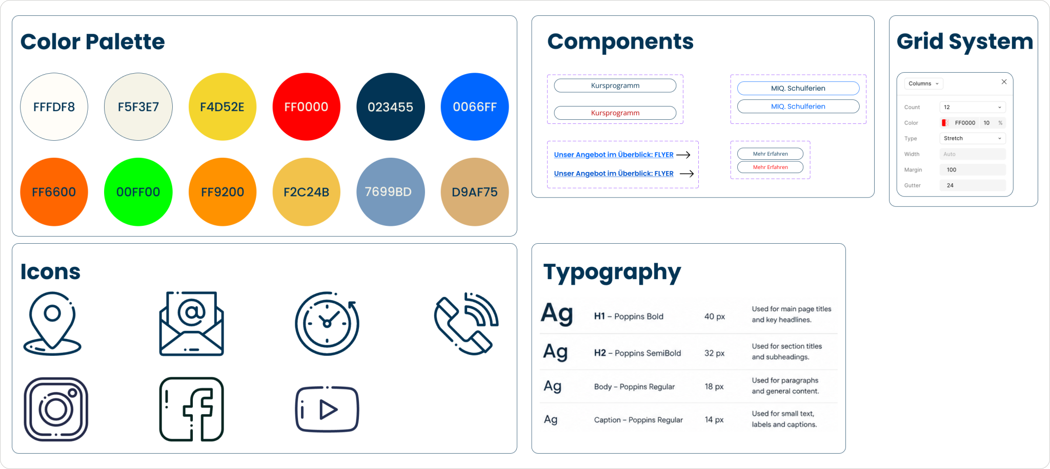
Design System
A simple design system was created to ensure visual consistency across all pages. It includes the primary color palette, typography, icons, and reusable components such as buttons and contact cards.
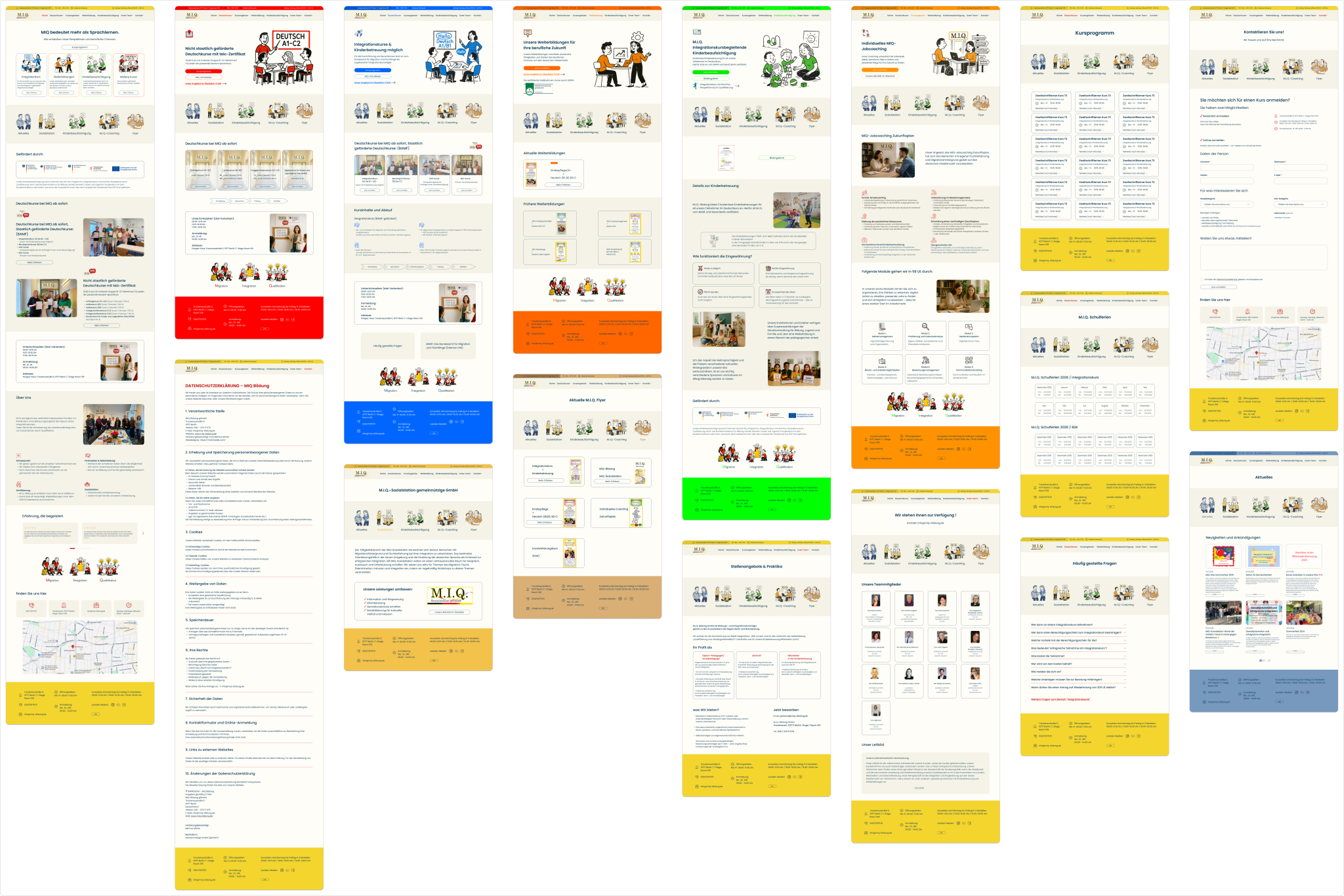
High-Fidelity Prototype
The final prototype covers 20+ pages designed in Figma — from the homepage to course details, enrollment forms, and mobile experience. Below are the key screens that brought the research, personas, and design system together. Built with accessibility, mobile-first responsiveness, and trust-building in mind for MIQ’s migrant audience.
As a former MIQ student, I thought I “knew” the user. I quickly learned that personal experience is not enough — every assumption needs research to back it up. Information architecture is harder than visual design. Reorganizing MIQ’s navigation took longer than designing the homepage itself. Designing for mobile-first made the whole site cleaner. Removing what’s not essential for Oksana on her phone helped the desktop version too.
What I would do differently
I built personas from observation, but I should have talked to real MIQ students. Formal interviews would have validated or challenged my assumptions. I also went from mid-fi → high-fi → done. Next time, I would test the prototype with 3–5 users before finalizing.
What’s next
— Run usability tests with current MIQ students — Design the full online enrollment flow — Add multilingual support (English, Ukrainian, Arabic) — Run a WCAG AA accessibility audit